Imagine walking into your wedding and feeling like every shade around you was handpicked from your dreams—or perhaps from a blooming Polish meadow, a golden autumn forest, or the regal halls of Wawel Castle. That’s the power of the right wedding color palette. If you're planning your dream wedding in Poland (congrats, by the way! 💍), choosing your colors isn’t just about “what’s pretty”—it’s about creating an atmosphere that reflects your story, your setting, and yes, your love for Poland’s incredible charm.
Ready to dive in? Let’s explore how to build a stunning color scheme that feels authentic, fresh, and unforgettable—just like your big day.
🎨 Traditional Polish Wedding Colors That Still Wow
Poland’s history and culture are full of rich, meaningful color inspirations—and no, we’re not just talking about pierogi-colored napkins (though, hey, that could be cute).
- Red and White: A patriotic nod to the Polish flag, this classic combo works beautifully when softened with ivory, blush, or gold. Try red florals with white linens for timeless elegance, or flip the script with all-white décor and subtle crimson accents.
- Folk Art Brights: Think Zakopane vibes, Łowicz patterns, and vibrant wycinanki paper art. Bold blues, sunflower yellows, grassy greens, and bright corals can bring your reception to life like a true Polish festival. Add embroidered ribbons, colorful florals, or traditional cutouts as fun pops throughout your décor.
🧡 Fun idea: Use folk-patterned table runners or napkins as statement pieces. Even grandma will be impressed.
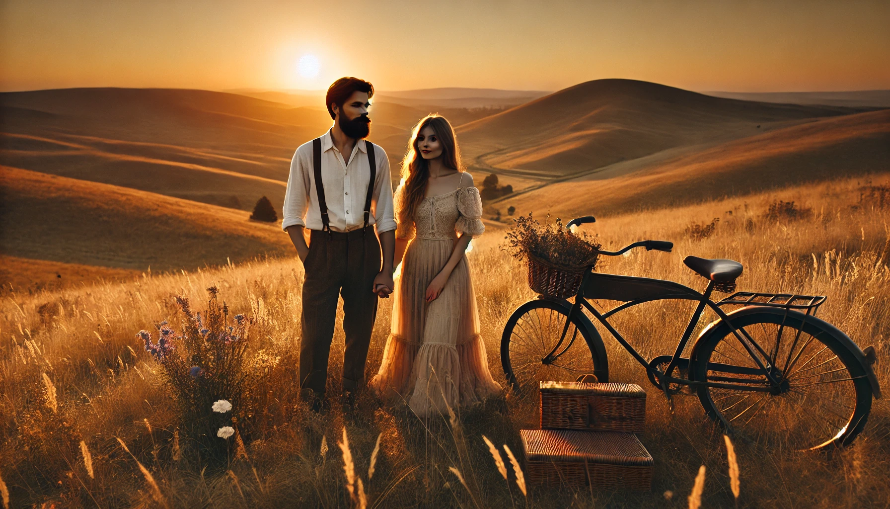
🌸 Let the Polish Seasons Be Your Guide
Poland has four strong seasons, and each comes with its own built-in mood board.
Spring (March–May): Pastels & Fresh Blooms
This season is all about soft pinks, light greens, and lilacs—perfect for a garden wedding or countryside manor. Complement with delicate flowers like peonies, tulips, and cherry blossoms.
Summer (June–August): Bold & Bright
Sun-drenched fields, blue skies, and fresh greenery set the stage for lively tones. Fuchsia, lavender, sunflower yellow, and ocean blue look incredible in outdoor spaces like Pałac Mała Wieś.
Autumn (September–November): Rich & Romantic
Poland’s golden forests beg for a palette of burnt orange, burgundy, deep green, and gold. A rustic barn venue like Cicha 23 would be a perfect match for this cozy combo.
Winter (December–February): Icy & Elegant
Go full snow queen with silver, icy blue, emerald, and white. Combine candles, crystal, and a fireplace or two, and boom—you've got a magical Polish winter wedding.
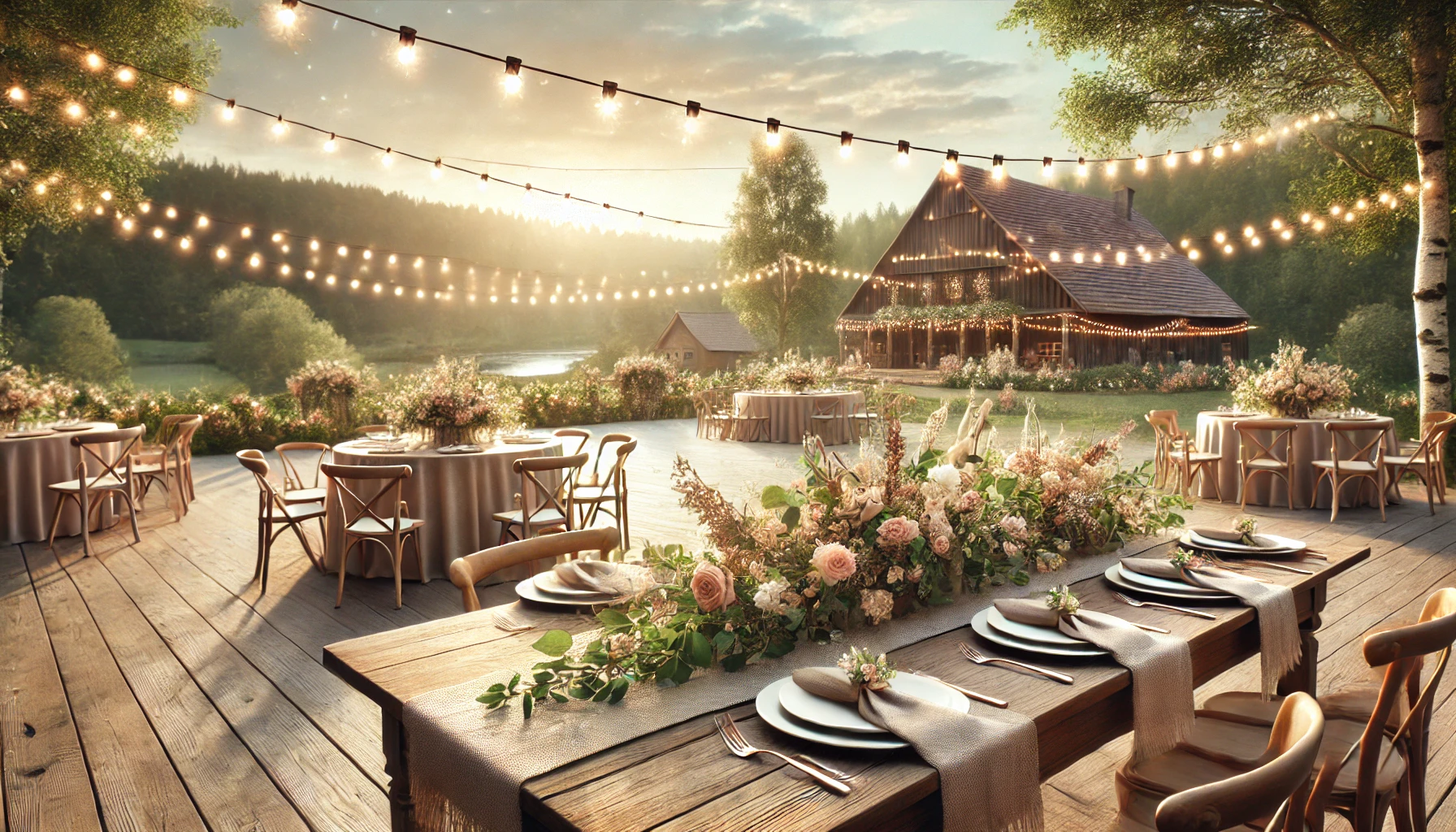
🏰 Venue Vibes: Let the Location Talk
Before you lock in a palette, consider your venue. The space can guide your aesthetic more than you think.
- Castles & Palaces – Channel regal vibes with rich colors like navy, gold, and deep red. Venues like Krasiczyn Castle practically beg for royal tones.
- Barns & Countryside Manors – Embrace earthy hues and warm neutrals. Greens, rust tones, and creams create a grounded, elegant rustic look.
- Urban Chic – If you're saying “I do” in Kraków or Warsaw, modern venues pair well with minimalist palettes—think charcoal, blush, ivory, and metallics.
🧩 Personalize Your Palette: It’s YOUR Love Story
This might sound obvious, but… choose colors that mean something to you. Was your first trip together in Gdańsk where the sunsets glowed golden-pink? Did you bond over a love of nature in the Bieszczady Mountains?
Pull colors from your memories:
- The suit he wore on your first date
- The café chairs where you first kissed
- The bouquet she carried at your sister’s wedding
🌟 Pro tip: Use free tools like coolors.co to build a palette from a photo you love.
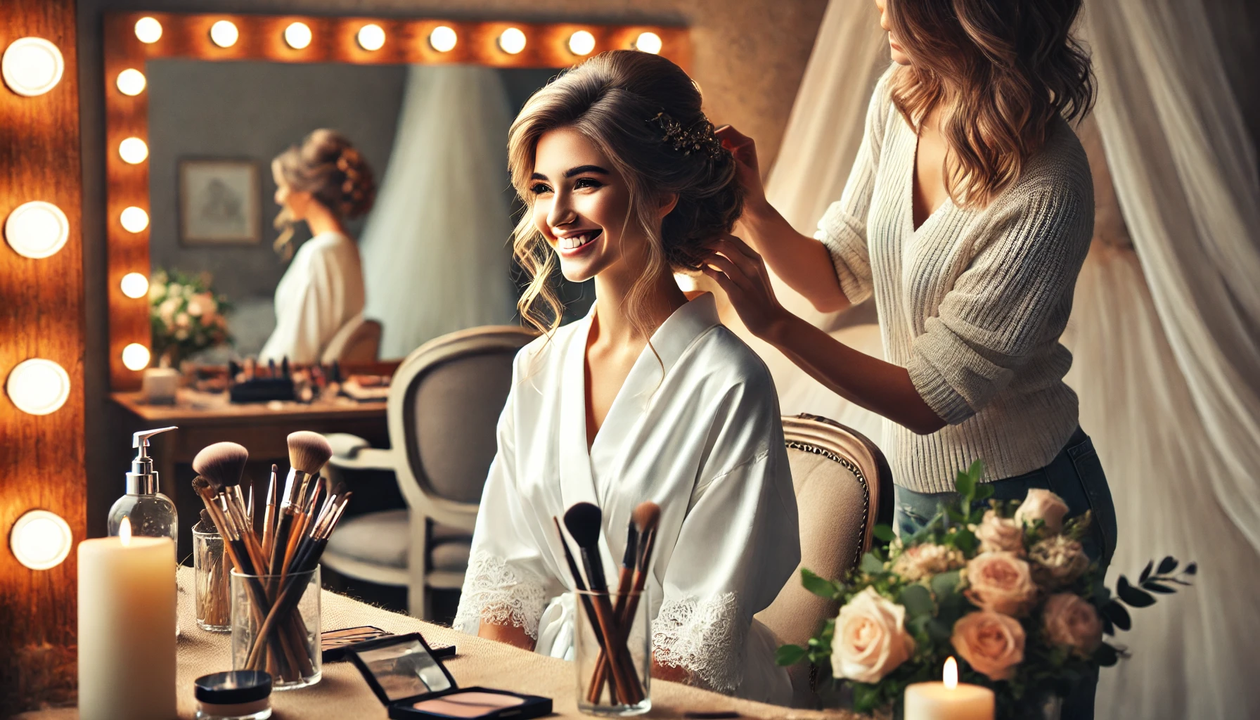
💡 Real Talk: Tips You Won’t Find on Pinterest
- Pick 2–3 main colors and 1–2 accents—don't overwhelm your theme.
- Match your stationery early: Save-the-dates and invitations are a sneak peek of your palette.
- Think about lighting! A dark barn or ballroom will mute soft pastels, while an airy venue makes bright tones pop.
😅 Avoid this mistake: Don't match everything. Your wedding is not a fruit basket. Add neutral tones to ground vibrant colors.
✨ Polish Traditions with a Modern Twist
Love tradition but want it fresh? Try these ideas:
- Combine folk embroidery patterns with clean, minimalist table settings.
- Use traditional colors in a soft watercolor style for signage and menus.
- Offer colorful Polish desserts—mazurek, faworki, or kremówki—in color-matching tiers.
💬 Questions to Ask Yourselves Before Picking Colors:
- What season are we getting married in?
- What kind of vibe do we want? (Romantic? Rustic? Modern?)
- What are our venue’s colors and textures?
- Are there cultural elements we want to include?
- What colors do we naturally love wearing or being around?
When you answer those questions, your palette often reveals itself.
📸 Now Capture It All (Because Color Deserves to Be Remembered)
If you’re investing time in designing a wedding that reflects your love story through color, don’t let those choices fade into memory. My job? To make sure every shade, every flower petal, and every golden sunset from your wedding day lives forever.
You can see how I capture these priceless moments in my wedding photography portfolio. Whether you're drawn to soft romance or vibrant folk vibes, I offer tailored photo packages to fit your vision. Want to talk details, share your dream palette, or just say “hej”? You’re always welcome to reach out through my contact page. Let’s turn your wedding day into art—one beautiful color at a time.
Color isn’t just visual—it’s emotional, it’s atmospheric, it’s the soul of your celebration. So go bold, go soft, go Polish. Whatever you do, make it yours. 💕
Share this story